Showing posts with label kitchen. Show all posts

Sunday, October 4, 2015

A kitchen story: Part II

Ok, here's the reveal! Some of these are pictures I took, and some were fisheye shots by my realtor's favorite photographer, made for the listing. Some have staging, and some are just before that happened...

kitchen_left_nude
Daylight really brings out the character of this place!

kitchen_center
This one gives you a great sense of the left side of the room.

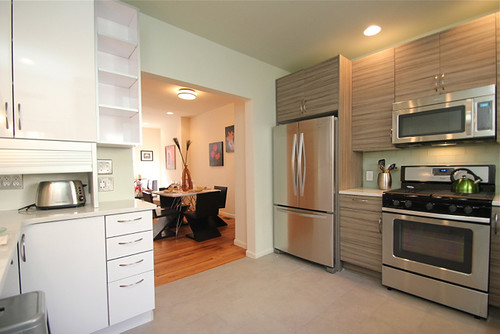
kitchen_right_wide
And this one of the right side, previously empty, now fully functional!

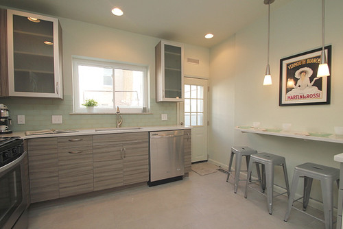
A couple of wide-angle shots will help clarify the geometry of all this.

kitchen_fisheye
Notice the BlueTooth speaker built in over the door...

kitchen_fisheye2
And here we get a little advance spoiler of the finished dining room
and the open appliance garage.

Here are a few additional details and little touches, for those who like a nice design photo.

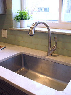
kitchen_sink
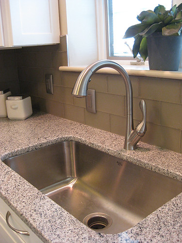
Grey quartz, 30" sink, and my favorite high faucet. Yum.

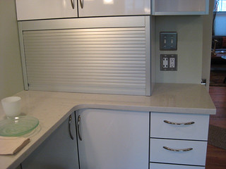
appliance_closed
A close-up of the appliance garage so that you can admire the
spiffy charging station (USB outlets!) alongside.

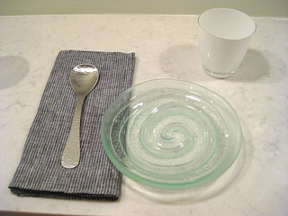
place_setting2
For good or ill, I staged the kitchen myself this time, except for the
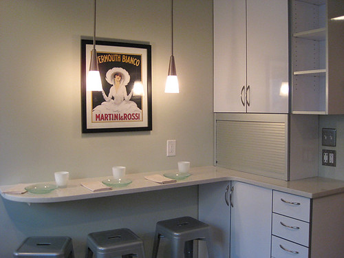
painting they threw up there. Love these plates and random napkins...

Well that's it for the kitchen. I guess I should pay off my spoiler above by continuing the first floor. Then I can take us to the upper levels for a trip from demo to staging. Hope to get more up soon!

A kitchen story: Part I

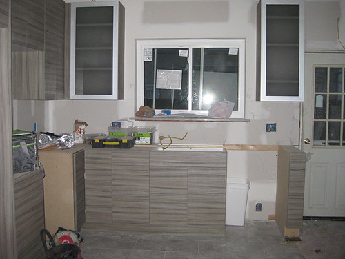
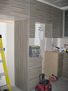
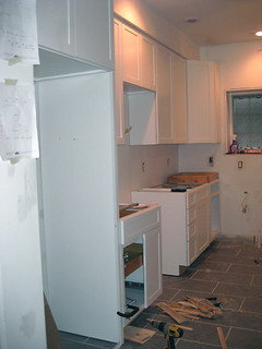
Ok, we've seen the gutted kitchen and some new framing going into it, but what about the fun stuff?!? We want to see the new kitchen come into existence! Apparently I didn't take photos of the floor by itself, but here some some cabinets...

kitchen_cabinets2

kitchen_cabinets

This left and center portion of the kitchen are getting cool gray cabinets with a trendy hyper-wood-grain finish -- the Eurokitchen look that I've been wanting to try (and which is giving this house its name). Man, my guys didn't know what to make of this; this is not the style they're used to. Luckily, they took some ribbing from me pretty well. The photos don't do justice to those aluminum cabinets! wow.

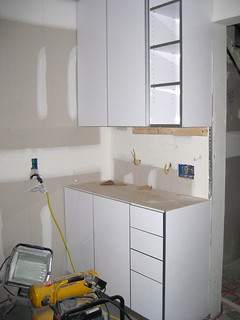
kitchen_cabinets3Meanwhile, over on the right side of the kitchen, I'm bringing in some shiny white cabinets. Just to lighten things up a bit, give some variety. It's all the same great line of semicustom cabinets (a new Euro line from Lowes called Latitude), just two different finishes. I think I thought it would give this side a bit of a butler's pantry feel. In addition, to leave room on the side wall for a breakfast bar (and to continue the pantry/hutch feel), we made the base cabinets only 15 inches deep (rather than the usual 24 inches). Still, a nice bank of drawers over there in addition to the cupboards, and the breakfast bar will mean extra counter too.

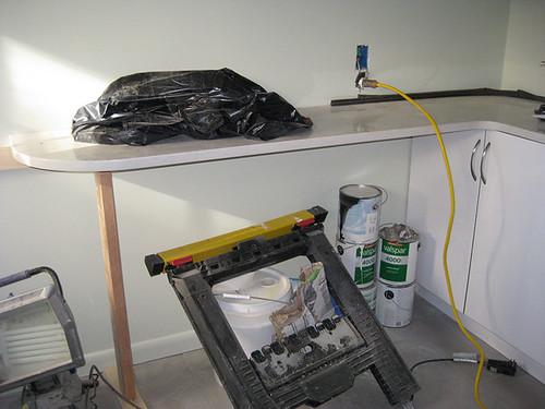
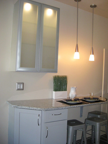
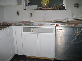
Here's a look at that breakfast bar. Unlike the last house, this one is basically entirely unsupported -- that is, there are no cabinets at the far end. And thus I was free to make it a bit slimmer than the standard base cabinet, since 15 inches is plenty of leg room to sit at comfortably.
counters2

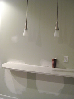
The shallower counter has two benefits here: (1) it allows full access to the cupboard on the right, rather than overhanging the door, and (2) it leaves a little more space in the room (and especially for the door to the patio). While there's a leg in this picture, it was eventually replaced by a pair of concealed brackets that bolt to the stone and then attach to the studs inside the wall where they won't bump anybody's knees. Here's a look after the leg came out and a couple of pendants were hung:

bbar+pendants

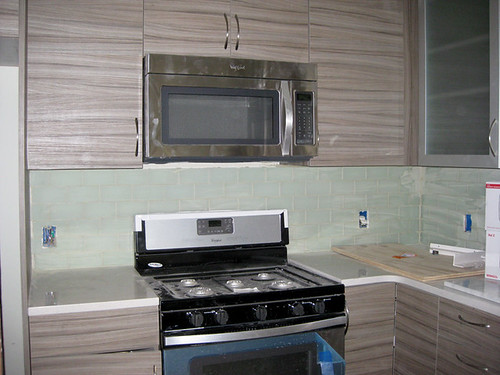
The character of this place really started to change when the backsplash and pulls went in, bringing some green and curves to balance all the cool modern grays and angles.

backsplash

About this time my redneck contractors started to come around and have admiring things to say about the kitchen, which gave me hope that I wasn't taking this style risk into a place where no buyer would follow!

Next post: more luscious photos of this room than you could possibly want!

A tale of rebuilding

Ok, I've managed to let a whole year go by without updating anything since the start of demo. In part that's because this project dragged on so long that I lost heart, and then the flurry of life sort of buried it. But I finally got all the photos processed and uploaded, and I want to fill in some of the blanks. However, since I'm not doing this in any semblance of real time, I'm not going to do it by bulk chronology. Instead, I think I'll take one room at a time and show how it developed, what the issues were, and how it came out. This is sort of a fun way to tell the story anyway, so I hope it will make for fun reading. Will see what approach I prefer for the next house in the pipe.

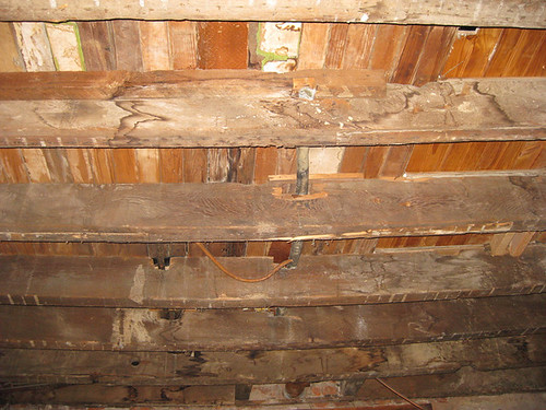
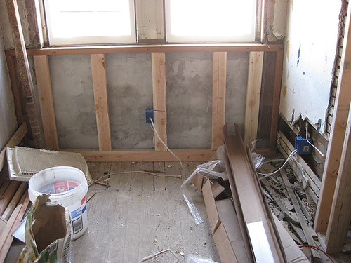
But first a little multi-room story about unexpected structural work. When last we saw the house, all the appliances and wall coverings had been stripped out, but we had yet to progress from there. The kitchen became the starting point for a major structural project: the rear wall had essentially failed over the last decade(s), and the entire shed (the addition comprising the kitchen, 2nd floor bathroom, and 3rd floor roof deck) was showing the effects.

kitchen_ceiling_joists

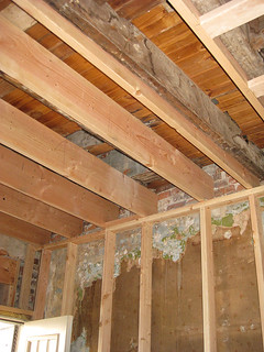
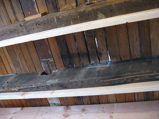
Specifically, the joists were bowed, as you can see in the photo of the kitchen ceiling above. There had been water damage down that wall from top to bottom, and the wood was doing its best but needed help. So once we had the place gutted, everything came to a halt while we rebuilt the framing from the basement up. That means all new studs supporting all new joists, "sistered" (bolted) to the existing ones to be sure everything above that was sturdy.

kitchen_reframing kitchen_joists_sistered

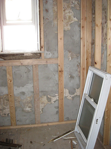
On the floor above, in the bathroom, was where a lot of the damage was visible (see the Story of the Bathroom, to follow) once we took the shower stall out. So, continuing the kitchen work, we put new studs along the side walls but also reinforced the masonry from the outside with new stucco and from the inside with strips of wood bolted to the bricks and running in a grid across the wall.

bath_wall_reinforcement

The work continued across into the rear bedroom, just for safety sake. Want to be sure this place is solid enough for the next few generations to be raised there!

BR2_wall_reinforced

These photos capture only a fraction of the work done to reinforce all the walls of this part of the house, but they give a sense. This was a lot of unplanned expense, but often the most important decisions a rehabber makes are the ones the buyers will never see. No point in putting beautiful finishes into a house that's falling apart!

Monday, September 1, 2014

Demo I: First floor chaos

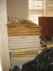
Well, when demo gets underway, it's a rush of destruction, with lumber, brick, and rolls of carpet piling up at the bottom of the stairs. I wasn't even sure the guys had started yet when I visited the house and was greeted by this:
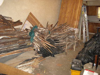
LR_lumber3

Needless to say, they were well underway pulling out the fake wood paneling and other crumbling bits upstairs. It probably took a week or more overall (with separate stops for, say, giving all the kitchen cabinets to Habitat), but it's just a stream of brick-filled bathtubs out into invisible trucks meantime...

Here are a couple more shots of the rubble:
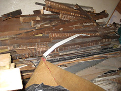
LR_lumber1 . LR_lumber2

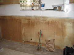
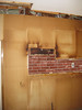
But a lot of the transformation is in the details.kitchen_nocabinets_C For example, here (left) is the main wall of the kitchen with no cabinets! Not clear if we're seeing discoloration on the lower section back there or just something before the last paint color, but anyway, kitchen_nocabinets_Lthere were also suspended bits of fake brick attached in midair, which I enjoy. (Honestly, I enjoy seeing the bones behind everything.)
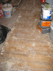
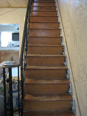
Here's some other stuff going on around the first floor. First, have seen the wood under all that carpeting, and it's pretty nice -- no inlay this time, but seems like it will clean up well, which is great.LR_floors The photo at right is a partial view under the demo dust, but the whole under-padding has been rolled back now, and it seems like there are just some mild discolorations in the diningroom area, so I'm hoping that it's all amenable to a light sand and stain -- will be consulting with my contractor to confirm this week.stairs_nocarpetThe next pic is of the de-carpeted stairs, which look mostly great, although originally there were more bars in the bannister, so we may have to decide whether to plug the resulting notches or not. Wood-wise, though, it's all very promising, for which my pocketbook is grateful. The hallways seem similarly ok, although there's been some wear (and some eras of paint!) up there. Bedroom floors are a different story, which I'll cover when I get up there.

The biggest development on the first floor happened toward the very end of last week, when the vestibule was pulled out (see prev. view here). It looks a little crazy with that wiring dangling where it used to be embedded in a wall, but the space immediately feels bigger and more natural, so I'm very excited about this choice and how things will look when we patch it all up again.
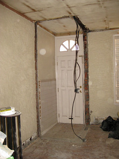
vestibule_gone

Not to mention actually getting the benefit of light from that transom window! All very nice. Anyway, most of the crazy stuff is done and the magical specialists of electricity, plumbing, and HVAC are working their wiles this week while all the walls are wide open, before the drywalling starts up the following week. No sitting around on this project! Deadlines will be kept! (yay!!)
Saturday, August 23, 2014

Before I: First floor

Ok, let's get a look inside and see what we started with here.
  • Living room/dining room space:

    Here's the livingroom/diningroom area as viewed from the far end of the room looking back toward the front. This house is a little shorter than the last one, so we'll be taking out that vestibule to open up the room a bit more (giving, say, room for an entryway table on the wall currently hogged up by the vestibule door).

    Here's a closer look at the doomed vestibule --- we'll replace it with a square or curve of tile set into the wood floor --- and the stair railing, which is pretty cute. Also visible in this shot is the densely textured plaster wall surface that is all over this level, and the "rustic" trim boards along the stairs, which are used everywhere for baseboards and trim. (Thank you, 1970s!) Those will be going, along with the carpet. There appears to be decent wood under there, but we'll have to pull the whole rug up to be sure, which will wait for the worst of the demo to go by...
    If you pivot toward the right, you get to the dining room area. This shot gives a view of the office-style drop ceiling that is on every floor of this house (and will be going) -- on some floors we'll reclaim a foot or more of ceiling by removing it, although on this floor it's just a few inches. That ceiling fan will also go, as the room isn't that large and the visual space is more valuable than a bit more circulation (which a new furnace and A/C will improve anyway).
    Below is a view of the stairs from the front door. You can see the stucco and drop ceiling again, and also get a first glimpse of the faux wood panelling that starts on the second floor.

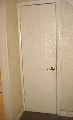
    basement_door The other notable feature of this floor is the door to the basement, which has an ornate veneer designed to match the rustic trim theme (a close-up of this work of art is here). We'll be taking this whole door frame apart anyway to make it a bit wider, so a new door is trivial by comparison. Not expecting much of an after-market for this one though!
  • Kitchen: This is the listing picture of the kitchen; the fisheye lens allows it to show almost the whole thing in one shot.

    As you can see, it's pretty livable, but also dated. The cabinets are quite short, given that there's a soffit under an already-low ceiling, and the doors, while quite stylish in 1968 or whenever, are oddly small by current standards and damaged in places. There's also no room for a dishwasher as arranged, so I was always ripping this out (and even budgeted for a new kitchen this time, heh), especially since I'm aiming for a higher trim-line on this house, which means KITCHEN KITCHEN KITCHEN (and MASTER BATH too). I hope that somebody from Habitat will find a good use for them, since the wood is quite nice.

    Here's a closer view of the left side of the kitchen. The built-in oven is quite small inside (amazingly so for the size of the family who lived here!), although having a wall oven and stove-top is an approach that's quite contemporary. (The oven itself is pure Jetsons in look -- wish I could find a vintage-lover to give it a new home.) The faux-brick backsplash here is pretty much the opposite of contemporary... Interestingly, it turns out that this entire wall of the kitchen stands out about 7-8 inches from the equivalent wall on the living room side -- I suspect that there's just one chimney back there, but I guess it's easier to build everything forward than to make use of additional space in only a subset of the space. Will have to see where everything falls when we get into the walls there, but unless the fridge can be pushed deeper, we'll probably be in the same situation. The new kitchen will follow this same general footprint, but with a regular range rather than these deep oven cabinets; hopefully the 42-inch cabinets will make up for any loss of storage in the exchange!

    This is the center wall of the kitchen. The biggest change for the feel of the place will be getting that huge A/C unit out of there (replaced with a dainty floor register) and getting a full-sized set of windows in there; should really be bright and welcoming! Will also be glad to rip off that granny trim -- it currently hides a set of lights, but we'll have recessed lighting over the sink and counters, so it shouldn't be missed. Also, bigger sink, higher modern faucet, dishwasher, blah blah blah. :)

    And here is the right-hand side of the kitchen! Not much to it currently, although they probably put a second table and chairs here. Getting those registers out means that we can reconsider the use of this wall for built-in stuff, and it will basically be a nice long breakfast bar when I'm done with it. Am doing quartz countertops this time, so no trip to the granite yard, but should be a striking piece of stone.

    This angle on the rear-right corner demonstrates why I can consider doing something with this side of the kitchen: because the door to the basement opens in the living room, there is a wide wall here (nearly four feet), and I'm going to put a hypermodern array of cabinets and fancy bits in there, leading into the nice breakfast bar -- my kitchen design guy at Lowes loves my take on this space so much that he plans to show it off as proof that they were right to carry this mod line of cabinetry! (The picture that captured/inspired my vision is this design at Houzz.) Can't wait to see it take shape -- will leave some of the bells and whistles for surprises in the After pics.

    So, that's the first floor. Will take you on a tour of the upper floors in my next installment.

Tuesday, June 17, 2014

Listing pics I: Staging and more details, first floor edition

Time for the unveiling! Lots of nice pics here that show off the final product and a lot of stylish staging. (The importance of the latter is underlined by the fact that interested buyers have asked for information on stagers to talk about buying a few pieces.) Am using the large size for your drooling pleasure. Will post some direct before-and-after comparisons later this week.

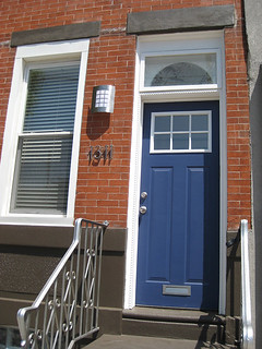
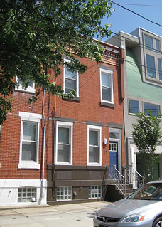
1=new_frontshot_firstThis photo is familiar from my previous "they painted it!" excitement, but I also used it as the first photo in the listing so that it would be the face of the listing (rather than the typical full-front shot, which can run together in the context of Philadelphia townhouses). I think it makes a strong graphical statement, while conveying the relatively contemporary feel of the rehab.

In the event, I ended up replacing the house numbers, because (a) there was damage to the brick from the previous plaque, which looked unpleasant when revealed by free-standing numbers, (b) the numbers were hard to read against the brick, and (c) there was a kind of "snotty" residue around the base of each digit after my guys installed them, and it looked very gross up close. You can see the new number in the before-and-after photo later, but this is the photo that will stay on the listing. Heh, could be a lot of buyers wouldn't even notice.

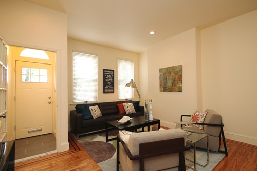
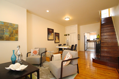
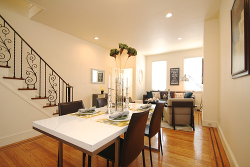
Here are three photos that give you a sense of the main floor LR/DR space, staging, and features (floor inlay, stair railing, closet, etc.):

2=IMG_8033
View toward the front of the house, with LR ensemble.

3=IMG_8037
View toward back, including DR area and staircase.

4=IMG_8046
View from DR, including cute bannister (and look at that floor!).


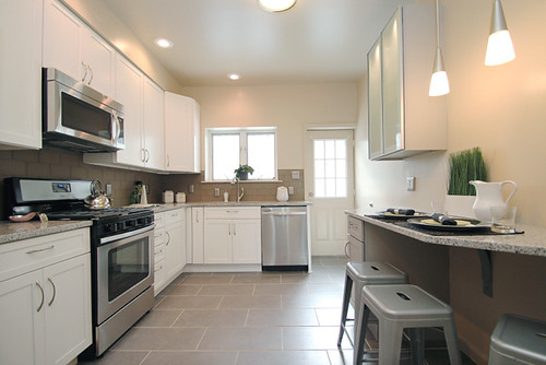
Next up, the fabulous new kitchen! (Cabinets are 42" tall, breakfast bar area completely new, glass cabinet a pure luxury.) Still in love with the concrete-look tile here, and with how it all came together.

5=IMG_8052_after
View from LR/DR, showing the whole layout.

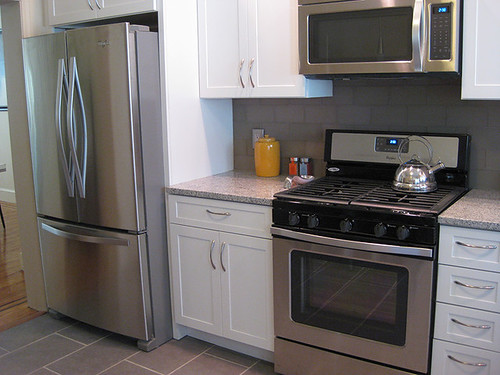
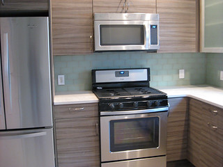
6=new_kitchen1_appliances
Turning left to show off the fancy appliance suite -- man, I want that stove!

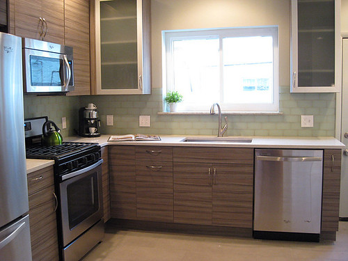
7=new_kitchen2_faucet
Close-up of extra-large sink, high faucet, fancy glass tile and granite.

8=new_kitchen3_Bbar
Direct view of glass cabinet, breakfast bar, spiffy lighting.


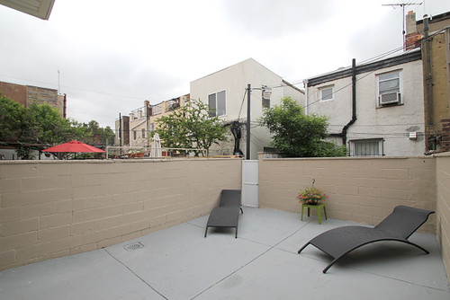
Last stop on our tour of the first floor is the patio, which has had a face-lift via a good sanding and some paint (which continued onto the rear of the house.

9=IMG_8061_after
View from the kitchen door. (Flowers from a Speck school fundraiser!)

10=IMG_8063
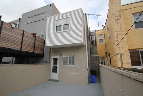
Back of house from patio. New A/C unit visible down side alley.


25=new_front_lastOk, I'll end with this photo for today -- it's the last photo in the actual listing, but since I'm dividing this bunch of photos by floor, I might as well include it here instead. As you can see, there's not much landscaping with a townhouse, but the city did plant that cute little tree just after I bought the place, so it will probably be shading the front stoop in a few years. If the house had taken longer to generate offers, I would probably have surrounded it with bright little flowers, but now the paperwork stuff is keeping me busy instead.

You can also see that we're next to a similar house (actually a row of them) on one side and a pretty different, radically modern, house on the other. The older houses all use street parking, but the modern house has its own garage, a practice that is at the center of a lot of controversy over new development. Parking turned out to be a worry for many of the folks who visited this house, so I'll have to keep that in mind with future purchases. As much as one can, in a dense metropolitan area!

Saturday, May 3, 2014

Quest for granite

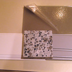
granite_sampleMost of my design for the kitchen was built around the white cabinets that it started with and a coordinating granite sample (from my friendly local kitchen designer). Once I realized I had to start over, I got some new cabinet samples to work with, and my "design board" looked a bit like the image at right (with some allowances for bad lighting -- that sample on the left there should be pure white!), based pretty much on the same idea. The granite is a mix of large grey and white patches with some tan. The cabinet samples are white and light grey, and the backsplash tile is a matte glass in a bottle brown color (to add a little warmth to the room).

I sat on this collection for a while before we got around to time for templating the cabinets for counter, and then I was told to head out to the "stone warehouse" to pick out my actual piece of granite! So off I went.

granite_warehouse

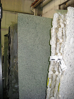
Here's the immense warehouse -- a little reminiscent of that giant government storage facility at the end of Raiders of the Lost Ark. Aisles of stone from around the world, mostly for countertops, in all colors and patterns. Slabs are probably 6 feet tall and 12 feet wide, so it's quite a walk!

granite_slabs . granite_close-up

Here's the slab I actually chose (left). Looks a bit darker in the photo than in person -- the close-up at right is probably the better approximation. A little finer-grained than my sample from three months before, but definitely the same general color mix.

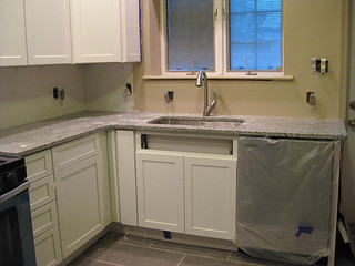
So, one templater, several weeks of cutting, and an afternoon's installation later (plus some work by my guys around the house), how's it look? Like a kitchen has been born!!! Closing in on civilization here!

kitchen_counters(sink)

kitchen_counter(stove)


I have to say that between the countertop and the light fixtures (and some other recent developments inside and outside the house), it's starting to look like we might actually get this place done soon! And I'm pretty excited to see it all finished and with the construction equipment (and dust!) out of there. Not to mention with a little furniture and daylight to lighten things up.

breakfast_bar_cabinet+counter2As for granite, another time I'd make visits to the warehouse earlier in the process, to be sure I got to look at more than one cut -- that is, this time I was looking at slabs that all came from the same slice of stone, so there wasn't much variation, but I imagine something new must come in every few weeks. I like the look of what I ended up with, but I'd be curious to see whether additional options would catch my eye when looking at the actual stones rather than just representative chips.

So, just waiting for some pulls to finish up this room, some flooring for under the washer and drier in the basement, and some cement work on the front where the awnings came down (yay!). Patio has been painted, basement carpeted, and bathrooms mostly done. More pictures to come! And hopefully a listing not far behind.

Wednesday, April 30, 2014

Kitchen taking shape!

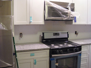
Well, at last the cabinets have been installed, and I can start to see the outlines of a pretty spiffy modern kitchen. The scale of 42-inch cabinets is a little hard to convey in photos, but it's very striking in person! I want these in my kitchen at home!!

kitchen_cabinets1

You can see the nice built-in compartment for the fridge at left and a gap for the stove and microwave. (Also, some glimpses into the interior machinery of the cabinets, which includes a bunch of nice roll-outs and so forth that got thrown in with my order as freebies.)

kitchen_cabinets2(sink)

Next up, the new sink base (gonna get a nice big one in there!) and dishwasher (the absence of which was part of why I had to gut the kitchen to begin with).

kitchen_cabinets_R

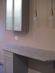
Continuing around, we come to the grey section of cabinetry, including a spiffy aluminum-and-glass wall cabinet (an extravegence I'm unlikely to repeat, but will definitely enjoy), and where there will be a breakfast bar once the countertops arrive.

These photos are a couple of weeks old already, so there's paint on the walls and other things falling into place. Next to show here: adventures with granite!!

Saturday, March 15, 2014

Kitchen developments

Well, the guys are finally turning their attention to the kitchen, where so much of my imaginative energy has been invested. I thought the house was a bit crazy when it had this many appliances in it:

appliances_waiting fridge

Of course, that was before the pile-up had added some cabinets and grown to look like this:

LR_chaos_more

But luckily, just this week the kitchen floor started to look like this:

kitchen_tile2

and then like this:

Kitchen_floor

The addition of the light gray grout to my concrete-looking grey tiles has absolutely made me salivate. Painting this room is up next. Can't wait to see all the rest of the components coming in there to match! Not to mention the granite that inspired it all!