- Living room/dining room space:
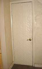 The other notable feature of this floor is the door to the basement, which has an ornate veneer designed to match the rustic trim theme (a close-up of this work of art is here). We'll be taking this whole door frame apart anyway to make it a bit wider, so a new door is trivial by comparison. Not expecting much of an after-market for this one though!
 - Kitchen: This is the listing picture of the kitchen; the fisheye lens allows it to show almost the whole thing in one shot.
Showing posts with label diningroom. Show all posts
Showing posts with label diningroom. Show all posts
Saturday, August 23, 2014
Before I: First floor
Ok, let's get a look inside and see what we started with here.
Tuesday, June 17, 2014
Listing pics I: Staging and more details, first floor edition
Time for the unveiling! Lots of nice pics here that show off the final product and a lot of stylish staging. (The importance of the latter is underlined by the fact that interested buyers have asked for information on stagers to talk about buying a few pieces.) Am using the large size for your drooling pleasure. Will post some direct before-and-after comparisons later this week.
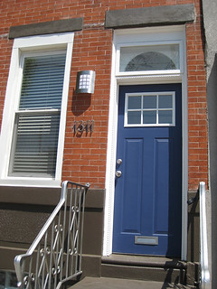 This photo is familiar from my previous "they painted it!" excitement, but I also used it as the first photo in the listing so that it would be the face of the listing (rather than the typical full-front shot, which can run together in the context of Philadelphia townhouses). I think it makes a strong graphical statement, while conveying the relatively contemporary feel of the rehab.
In the event, I ended up replacing the house numbers, because (a) there was damage to the brick from the previous plaque, which looked unpleasant when revealed by free-standing numbers, (b) the numbers were hard to read against the brick, and (c) there was a kind of "snotty" residue around the base of each digit after my guys installed them, and it looked very gross up close. You can see the new number in the before-and-after photo later, but this is the photo that will stay on the listing. Heh, could be a lot of buyers wouldn't even notice.
Here are three photos that give you a sense of the main floor LR/DR space, staging, and features (floor inlay, stair railing, closet, etc.):
This photo is familiar from my previous "they painted it!" excitement, but I also used it as the first photo in the listing so that it would be the face of the listing (rather than the typical full-front shot, which can run together in the context of Philadelphia townhouses). I think it makes a strong graphical statement, while conveying the relatively contemporary feel of the rehab.
In the event, I ended up replacing the house numbers, because (a) there was damage to the brick from the previous plaque, which looked unpleasant when revealed by free-standing numbers, (b) the numbers were hard to read against the brick, and (c) there was a kind of "snotty" residue around the base of each digit after my guys installed them, and it looked very gross up close. You can see the new number in the before-and-after photo later, but this is the photo that will stay on the listing. Heh, could be a lot of buyers wouldn't even notice.
Here are three photos that give you a sense of the main floor LR/DR space, staging, and features (floor inlay, stair railing, closet, etc.):
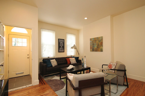 View toward the front of the house, with LR ensemble.
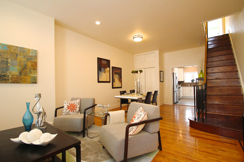 View toward back, including DR area and staircase.
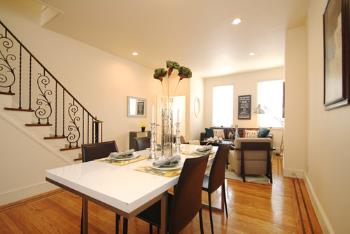 View from DR, including cute bannister (and look at that floor!).
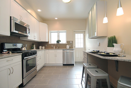
Next up, the fabulous new kitchen! (Cabinets are 42" tall, breakfast bar area completely new, glass cabinet a pure luxury.) Still in love with the concrete-look tile here, and with how it all came together.
 View from LR/DR, showing the whole layout.
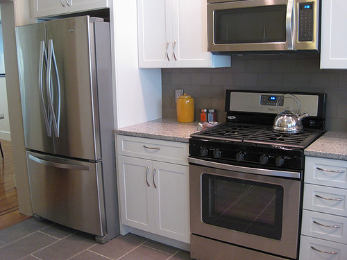 Turning left to show off the fancy appliance suite -- man, I want that stove!
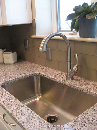 Close-up of extra-large sink, high faucet, fancy glass tile and granite.
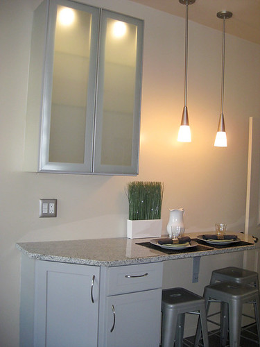 Direct view of glass cabinet, breakfast bar, spiffy lighting.
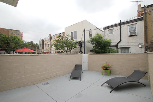
Last stop on our tour of the first floor is the patio, which has had a face-lift via a good sanding and some paint (which continued onto the rear of the house.
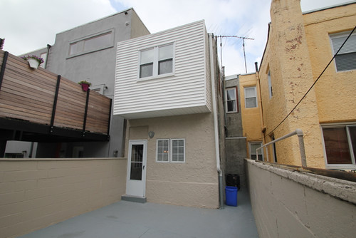
 View from the kitchen door. (Flowers from a Speck school fundraiser!)
 Back of house from patio. New A/C unit visible down side alley.
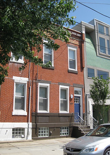 Ok, I'll end with this photo for today -- it's the last photo in the actual listing, but since I'm dividing this bunch of photos by floor, I might as well include it here instead. As you can see, there's not much landscaping with a townhouse, but the city did plant that cute little tree just after I bought the place, so it will probably be shading the front stoop in a few years. If the house had taken longer to generate offers, I would probably have surrounded it with bright little flowers, but now the paperwork stuff is keeping me busy instead.
You can also see that we're next to a similar house (actually a row of them) on one side and a pretty different, radically modern, house on the other. The older houses all use street parking, but the modern house has its own garage, a practice that is at the center of a lot of controversy over new development. Parking turned out to be a worry for many of the folks who visited this house, so I'll have to keep that in mind with future purchases. As much as one can, in a dense metropolitan area!
Ok, I'll end with this photo for today -- it's the last photo in the actual listing, but since I'm dividing this bunch of photos by floor, I might as well include it here instead. As you can see, there's not much landscaping with a townhouse, but the city did plant that cute little tree just after I bought the place, so it will probably be shading the front stoop in a few years. If the house had taken longer to generate offers, I would probably have surrounded it with bright little flowers, but now the paperwork stuff is keeping me busy instead.
You can also see that we're next to a similar house (actually a row of them) on one side and a pretty different, radically modern, house on the other. The older houses all use street parking, but the modern house has its own garage, a practice that is at the center of a lot of controversy over new development. Parking turned out to be a worry for many of the folks who visited this house, so I'll have to keep that in mind with future purchases. As much as one can, in a dense metropolitan area!
This photo is familiar from my previous "they painted it!" excitement, but I also used it as the first photo in the listing so that it would be the face of the listing (rather than the typical full-front shot, which can run together in the context of Philadelphia townhouses). I think it makes a strong graphical statement, while conveying the relatively contemporary feel of the rehab.
In the event, I ended up replacing the house numbers, because (a) there was damage to the brick from the previous plaque, which looked unpleasant when revealed by free-standing numbers, (b) the numbers were hard to read against the brick, and (c) there was a kind of "snotty" residue around the base of each digit after my guys installed them, and it looked very gross up close. You can see the new number in the before-and-after photo later, but this is the photo that will stay on the listing. Heh, could be a lot of buyers wouldn't even notice.
Here are three photos that give you a sense of the main floor LR/DR space, staging, and features (floor inlay, stair railing, closet, etc.):
View toward the front of the house, with LR ensemble.
View toward back, including DR area and staircase.
View from DR, including cute bannister (and look at that floor!).
View from LR/DR, showing the whole layout.
Turning left to show off the fancy appliance suite -- man, I want that stove!
Close-up of extra-large sink, high faucet, fancy glass tile and granite.
Direct view of glass cabinet, breakfast bar, spiffy lighting.
View from the kitchen door. (Flowers from a Speck school fundraiser!)
Back of house from patio. New A/C unit visible down side alley.
Ok, I'll end with this photo for today -- it's the last photo in the actual listing, but since I'm dividing this bunch of photos by floor, I might as well include it here instead. As you can see, there's not much landscaping with a townhouse, but the city did plant that cute little tree just after I bought the place, so it will probably be shading the front stoop in a few years. If the house had taken longer to generate offers, I would probably have surrounded it with bright little flowers, but now the paperwork stuff is keeping me busy instead.
You can also see that we're next to a similar house (actually a row of them) on one side and a pretty different, radically modern, house on the other. The older houses all use street parking, but the modern house has its own garage, a practice that is at the center of a lot of controversy over new development. Parking turned out to be a worry for many of the folks who visited this house, so I'll have to keep that in mind with future purchases. As much as one can, in a dense metropolitan area!
Subscribe to:
Posts (Atom)