Saturday, August 23, 2014

Before I: First floor

Ok, let's get a look inside and see what we started with here.
  • Living room/dining room space:

    Here's the livingroom/diningroom area as viewed from the far end of the room looking back toward the front. This house is a little shorter than the last one, so we'll be taking out that vestibule to open up the room a bit more (giving, say, room for an entryway table on the wall currently hogged up by the vestibule door).

    Here's a closer look at the doomed vestibule --- we'll replace it with a square or curve of tile set into the wood floor --- and the stair railing, which is pretty cute. Also visible in this shot is the densely textured plaster wall surface that is all over this level, and the "rustic" trim boards along the stairs, which are used everywhere for baseboards and trim. (Thank you, 1970s!) Those will be going, along with the carpet. There appears to be decent wood under there, but we'll have to pull the whole rug up to be sure, which will wait for the worst of the demo to go by...

    If you pivot toward the right, you get to the dining room area. This shot gives a view of the office-style drop ceiling that is on every floor of this house (and will be going) -- on some floors we'll reclaim a foot or more of ceiling by removing it, although on this floor it's just a few inches. That ceiling fan will also go, as the room isn't that large and the visual space is more valuable than a bit more circulation (which a new furnace and A/C will improve anyway).

    Below is a view of the stairs from the front door. You can see the stucco and drop ceiling again, and also get a first glimpse of the faux wood panelling that starts on the second floor.

    basement_door 
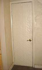
The other notable feature of this floor is the door to the basement, which has an ornate veneer designed to match the rustic trim theme (a close-up of this work of art is here). We'll be taking this whole door frame apart anyway to make it a bit wider, so a new door is trivial by comparison. Not expecting much of an after-market for this one though!
  • Kitchen: This is the listing picture of the kitchen; the fisheye lens allows it to show almost the whole thing in one shot.

    As you can see, it's pretty livable, but also dated. The cabinets are quite short, given that there's a soffit under an already-low ceiling, and the doors, while quite stylish in 1968 or whenever, are oddly small by current standards and damaged in places. There's also no room for a dishwasher as arranged, so I was always ripping this out (and even budgeted for a new kitchen this time, heh), especially since I'm aiming for a higher trim-line on this house, which means KITCHEN KITCHEN KITCHEN (and MASTER BATH too). I hope that somebody from Habitat will find a good use for them, since the wood is quite nice.

    Here's a closer view of the left side of the kitchen. The built-in oven is quite small inside (amazingly so for the size of the family who lived here!), although having a wall oven and stove-top is an approach that's quite contemporary. (The oven itself is pure Jetsons in look -- wish I could find a vintage-lover to give it a new home.) The faux-brick backsplash here is pretty much the opposite of contemporary... Interestingly, it turns out that this entire wall of the kitchen stands out about 7-8 inches from the equivalent wall on the living room side -- I suspect that there's just one chimney back there, but I guess it's easier to build everything forward than to make use of additional space in only a subset of the space. Will have to see where everything falls when we get into the walls there, but unless the fridge can be pushed deeper, we'll probably be in the same situation. The new kitchen will follow this same general footprint, but with a regular range rather than these deep oven cabinets; hopefully the 42-inch cabinets will make up for any loss of storage in the exchange!

    This is the center wall of the kitchen. The biggest change for the feel of the place will be getting that huge A/C unit out of there (replaced with a dainty floor register) and getting a full-sized set of windows in there; should really be bright and welcoming! Will also be glad to rip off that granny trim -- it currently hides a set of lights, but we'll have recessed lighting over the sink and counters, so it shouldn't be missed. Also, bigger sink, higher modern faucet, dishwasher, blah blah blah. :)

    And here is the right-hand side of the kitchen! Not much to it currently, although they probably put a second table and chairs here. Getting those registers out means that we can reconsider the use of this wall for built-in stuff, and it will basically be a nice long breakfast bar when I'm done with it. Am doing quartz countertops this time, so no trip to the granite yard, but should be a striking piece of stone.

    This angle on the rear-right corner demonstrates why I can consider doing something with this side of the kitchen: because the door to the basement opens in the living room, there is a wide wall here (nearly four feet), and I'm going to put a hypermodern array of cabinets and fancy bits in there, leading into the nice breakfast bar -- my kitchen design guy at Lowes loves my take on this space so much that he plans to show it off as proof that they were right to carry this mod line of cabinetry! (The picture that captured/inspired my vision is this design at Houzz.) Can't wait to see it take shape -- will leave some of the bells and whistles for surprises in the After pics.

    So, that's the first floor. Will take you on a tour of the upper floors in my next installment.

No comments:

Post a Comment